My Bag
No products in the cart.
No products in the cart.
Setting up convention booths can be one of the most exciting—and nerve-wracking—parts of event marketing. It’s the space where businesses show off who they are, what they do, and what makes them worth remembering. But there’s a catch: trying too hard to impress can backfire. In fact, overcomplicating the design and setup of convention booths often leads to more headaches than conversions.
There’s a growing trend of turning simple booths into complex mazes, from excessive design elements to unnecessary high-tech installations. And while it might seem like going big is the right move, the hidden costs say otherwise. Here’s how overdoing it can quietly drain your budget, consume time and energy, and make it harder to connect with the people you’re there to meet.

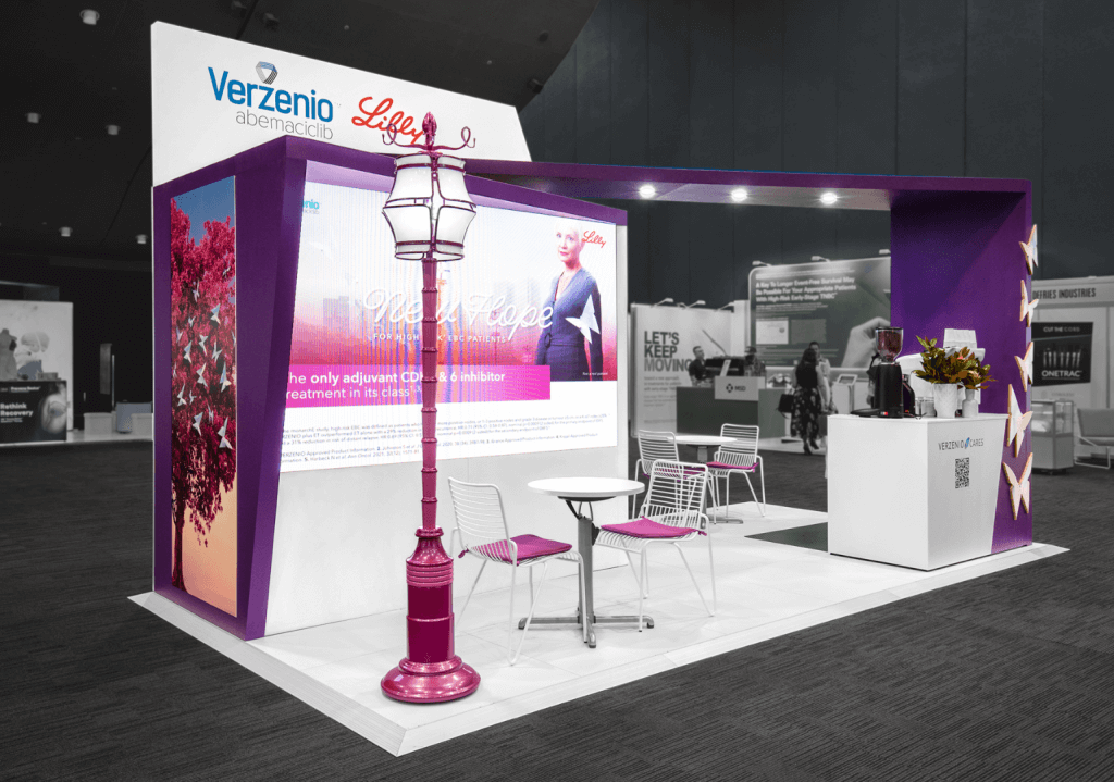
There’s a sweet spot in booth design where form meets function. But once a booth goes beyond that point—adding walls, sound systems, interactive displays, or custom structures just to stand out—the returns start to drop fast. Overcomplicated convention booths not only cost more to build and transport but also require more time to set up, more hands on deck, and more budget to maintain. For many teams, that means sacrificing funds that could’ve been better spent on staff training, follow-up strategies, or high-impact freebies.
Sometimes, the drive to be the most unique in the hall leads to a booth that’s hard to manage or confusing for attendees. The simpler route may seem less exciting, but it often becomes smarter play.
Custom-built elements like towering room dividers or heavy architectural features can quickly drive up costs. While they may look impressive in mock-ups, their real-world impact doesn’t always match the investment, especially if they interfere with visibility or the natural flow of foot traffic.
It’s not just the build cost, either. Heavier structures cost more to ship and have higher drayage fees, and depending on the venue, they might require extra labour or permits. Instead of going all-in on bulk, aim for smarter solutions. Lightweight materials, modular systems, and fabric backdrops can still deliver a polished, high-impact presence—without the added logistical load.
Tech can enhance the registration experience—touchscreens, tablets, and custom lighting can make your space feel polished and modern—but there’s a point where it can start to work against you. Each new gadget adds to the budget and increases the chances of hiccups during the event. If something needs attention, you might need extra power, stronger Wi-Fi, or someone nearby.
Using tech thoughtfully is the key. A few well-placed tools can streamline check-in and create a smooth first impression. Just avoid going overboard—sometimes, a straightforward setup does a better job of keeping things moving and the team focused.
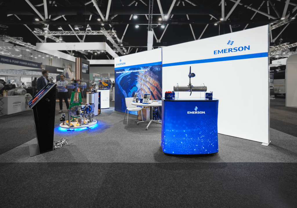
Not every booth needs a fully custom-built station to make an impact. A well-designed pop up counter can do a lot of heavy lifting—offering space for demos, materials, and conversations without eating into your budget or floor plan.
Pop up counters are lightweight, easy to brand, and quick to set up. They also allow you to adjust your layout on the fly, which is a major plus if you’re exhibiting in different venues or dealing with tight configurations. When the booth needs to remain flexible and functional, modular pieces like these can be a smart way to keep things simple while still looking polished.

Custom flooring, shelving, and accessories can look incredible and bring a booth together. But when every piece is custom-made, the costs can snowball quickly. You don’t have to skip the custom touches—just be selective.
Adding a few custom elements to your media wall, like smart, modular pieces, gives you the same elevated look without the oversized price tag. Modular systems are flexible, professional, and often reusable, which adds value over time. It’s all about finding the right balance between impact and practicality.
An overcomplicated booth layout filled with unnecessary colours, structures, awkward barriers, or confusing pathways can seriously disrupt visitors’ movement through your space. When people feel unsure of where to go—or worse, blocked from exploring—they’re less likely to engage with your team or even stick around. That means fewer conversations, missed opportunities, and a lot of wasted potential.
Good traffic flow encourages natural movement, draws people in, and makes it easy for them to engage with your pull up banners, ask questions, and connect with your team. It’s not just about looking good—it’s creating a space that invites interaction and makes the most of your time on the floor. Keep it open, intuitive, and welcoming. A smooth layout helps keep things running efficiently for your team and everyone visiting your booth.
Convention booths don’t need to be overdesigned to make an impact. A simplified approach often works better—cutting costs, streamlining setup, and helping your team focus on what matters: engaging with attendees. A clean, organised, and purposeful booth tends to stand out more than once, overwhelmed with too many design elements or tech gimmicks.
It’s easy to fall into the trap of thinking that more equals better—more displays, structures, and visual noise. However, that approach often leads to higher expenses and lower returns. Clutter can crowd out your message and leave visitors unsure where to look or what to do. By narrowing in on what’s essential, you can create a space that communicates clearly and efficiently without putting pressure on your budget or staff.
Start with the basics: a focused layout, wall divider, registration counter, and smart signage like pop up banners or exhibition stands. Then, build from there, only adding elements directly supporting your objectives. The result? A setup that feels intentional looks professional and invites people in.