
My Bag
No products in the cart.
No products in the cart.
An expo booth that looks good on paper doesn’t always perform well in practice. The banners are up, the handouts are stacked, the team’s ready—but something still feels off. People pass by without stopping, conversations are short, and the booth doesn’t pull the attention it should.
Chances are, there are a few small problems at play. Nothing dramatic—just subtle things in your setup or presentation that make it easy for people to walk past. When those go unchecked, even the best team or product can get lost in the crowd.
Here’s what could be holding your booth back—and how to fix it.
You have a few seconds at most in a busy trade show to catch someone’s interest. If your expo booth doesn’t clearly show who you are or what you offer, most people won’t stop to figure it out.
This often comes down to unclear signage, too much text, or visuals that don’t say anything. The fix? Simplicity and purpose. Make sure your key message is front and centre. Avoid explaining everything at once—just lead with what matters most.
Use your exhibition display walls to reinforce your message visually. Consistent branding, clean layouts, and bold headlines go a long way.
If your exhibition still uses dated designs, heavy frames, or graphics that have seen better days, it will affect how people view your brand. Even if your offer is solid, the first impression says otherwise.
Modern setups don’t have to be complicated. Portable, clean, and on-brand designs show you’re active and current. For example, portable display stands for exhibitions offer flexibility and a more polished finish without adding setup headaches.
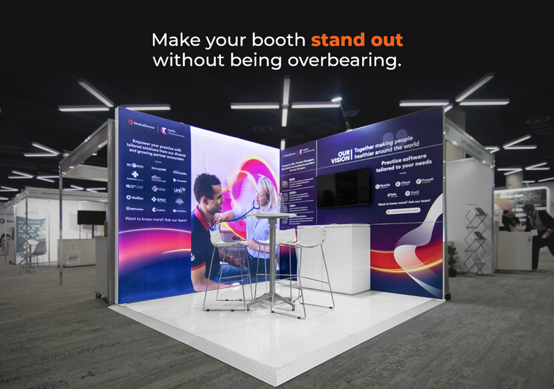
Want something that draws attention naturally? A lightbox display can make your booth stand out without being overbearing. Subtle backlighting highlights your branding without shouting for it.
The shape and structure of your booth matter more than most people realise. If your setup makes it unclear where people should walk or who to approach, they’ll keep moving. A layout that blocks entry points hides key materials, or makes staff hard to spot quietly discourages interaction.
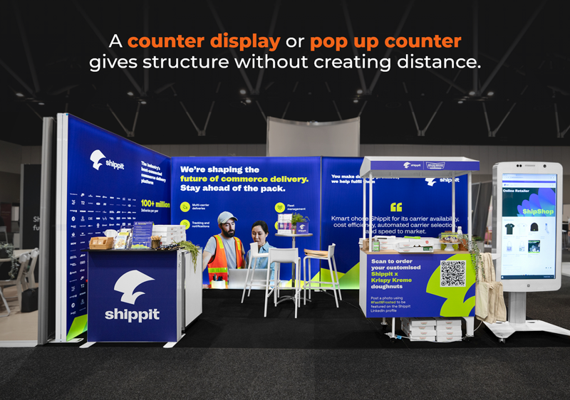
Creating flow is key. Think of open sightlines and clear zones—spaces for demos, conversations, and quick engagement. Even a simple pop up counter placed strategically can guide visitors into your space. A well-placed counter display can also give people something to engage with while they wait or browse.
When everything in your booth is bold, bright, or busy, the overall effect is just… noise. Visitors don’t know where to look, so they don’t look at all.
Balance matters. Not every piece of your booth needs to shout. Let your display walls support your branding without overwhelming it. Use colour and lighting to draw the eye where you want it—your offer, a product demo, or a clear CTA.
Even the best booth design won’t do much if the people running it feel unsure or unprepared. If your team doesn’t know the main messaging or the booth layout doesn’t give them room to work effectively, the experience starts to fall apart.
This is often less about training and more about the environment. Make sure your booth gives your team room to move and space for real conversations. They should be easy to approach, not tucked behind tables or lost in a crowd.
A counter display or pop up counter gives structure without creating distance. Use it as a landing spot for brochures, product samples, or quick demos.
Showing everything at once is one of the easiest ways to lose impact. You don’t need to squeeze your entire catalogue into your booth. A handful of clear messages, supported by sharp visuals, does more than pages of detail.
Stick to one or two key offerings or updates. Rotate your booth materials depending on the event. Use technology where it helps—touchscreens, quick video loops, or QR codes for more detail—but only if it supports the main point.
A stack of brochures doesn’t equal a great booth. While printed materials have their place, using them as a catch-all quickly overwhelms visitors and creates clutter. People are unlikely to carry around 12-page product guides or a thick flyer pack—especially when they’ve already been handed five others.
Instead, keep your counter display minimal. One clear handout that hits your main points is more effective than a pile of detailed collateral. Better yet, use QR codes that link to digital versions. This will lighten your booth and make you look more streamlined.
An expo is noisy, fast, and full of movement. Having a space in your booth where visitors can pause—even for a moment—makes you stand out. When everything around them is high-energy and loud, a small “pause point” is inviting.
This could be as simple as a stool beside a counter display, a standing table with samples, or a seating bench near your expo stands. It doesn’t need to be fancy—just functional. People tend to stay longer when there’s room to stop without pressure.
Last but not least—what happens after the event matters just as much. If your booth doesn’t make collecting leads easy or encourage the next steps, all the effort can fade quickly.
This isn’t just about giveaways or competitions. It’s about making sure every visitor knows what to do next. Add a digital sign-up form, QR code, or a clear “let’s chat” CTA. And make sure your materials (and your team) know how to guide that conversation.
Pay closer attention to layout, messaging, flow, and how people move through your space to shift the outcome without overhauling everything. Small changes can make a measurable difference, such as upgrading tired exhibition stands, adding a focused lightbox display, or streamlining your counter display. It’s worth reviewing your setup before the next event. What’s helping? What’s just filling space? What’s standing in the way of real engagement?
Get your booth working smarter, not just harder—and you’ll start seeing the difference.