
My Bag
No products in the cart.
No products in the cart.
Businesses invest heavily in building a digital presence—from curated websites to consistent social media messaging. But when it’s time to show up in person, your conference stand must reflect that same identity.
So, how do you translate what works online into something that connects in the real world? Here’s how to carry your online messaging to your conference presence in a cohesive, engaging, and memorable way.
Your conference stand is often the first physical touchpoint for people who’ve only interacted with your brand online. That’s why consistency matters. Everything from your visuals and copy to your voice should feel familiar—like a natural continuation of your website or social platforms.
In this article, we’ll look at how to bring your online messaging to life through an effective conference stand presence.
The layout of your portable stands shapes how people respond to it from the moment they approach it. A cluttered or disorganised exhibition display makes it harder for visitors to navigate a venue where attention is limited and time is short. Crowded tables, unclear pathways, or too many competing visuals can create friction before a conversation starts.
A well-structured display gives people an immediate sense of where to begin and how to move through the space. There is no guesswork, no awkward back-and-forth. When navigation feels smooth, people are more likely to explore, take in what’s offered, and connect with your team naturally.
High quality signage plays a quiet but important role in how attendees experience your booth. Within seconds, they should be able to glance at your display and understand what’s happening and where to go. Clear, well-placed headings like “Live Demo,” “Chat with a Rep,” or “Giveaway Table” help guide people without slowing them down or causing confusion. There’s no need for complicated messaging—plain, direct wording works best when attention is limited.
Design and readability are just as important as the message itself. The exhibition display can feel unorganised when signs are too small, cluttered, or visually inconsistent. On the other hand, durable materials, clean typography, and consistent spacing help the space feel considered and approachable. That kind of attention to detail makes it easier for attendees to find what they need and stay engaged.
When everything has a place, it helps visitors feel more comfortable exploring. Separate your space into distinct zones tailored to the interaction you want to encourage. One section could host live demonstrations or product testing, while another offers seating for more in-depth discussions or casual networking. Maybe there’s an area for giveaways, a screen playing a looped explainer video, or a quiet corner with a charging station. These micro-environments help organise the experience, reduce pressure, and allow people to engage on their terms.
While your team plays a key role, not everyone wants—or needs—an immediate one-on-one. Including interactive features like digital product tours, quizzes, or games invites people to get involved at their own pace. Consider touchscreens with swipe-through content, AR features, or product customisation tools. These keep people occupied longer and allow your team to focus their energy where it’s most impactful. It’s about offering value before anyone even starts a conversation.
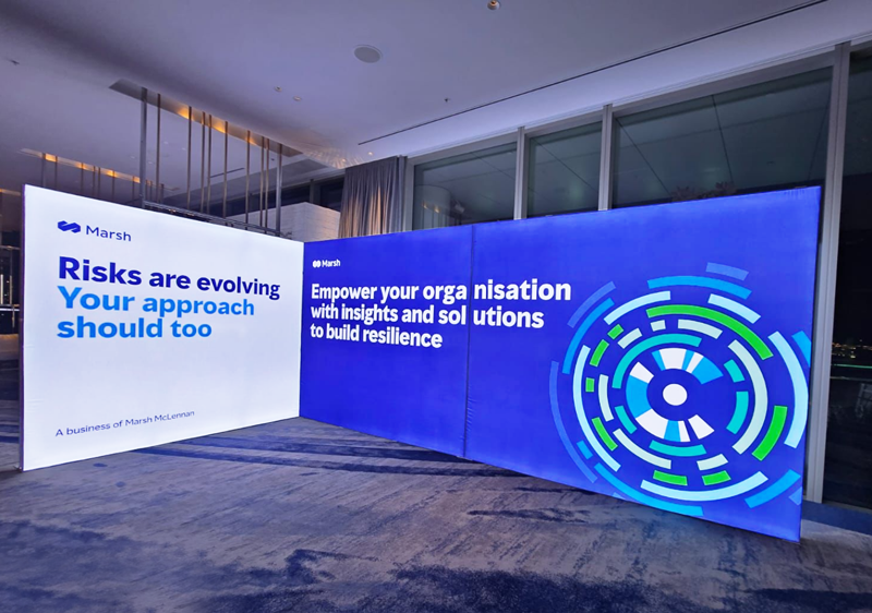
The most effective booths mirror your digital presence in tone, style, and structure. Visitors should feel a lasting impression and seamless connection between the booth experience and what they’ve seen online—through your website, app, or social channels. Use familiar visuals, colours, and brand language to avoid disconnect. When someone already knows your brand online, the in-person experience should feel like a natural continuation, reinforcing everything they liked and expected.
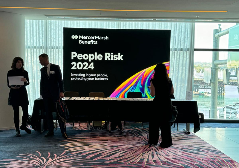
A branded media backdrop does more than fill space—it helps define the environment around your exhibition booth. From conducting interviews and creating content for social media, to simply adding a strong visual anchor, a well-designed backdrop becomes a natural focal point. It can feature your logo, the event theme, or a graphic element that draws interest without feeling overdone.
Placing it near a registration counter can make the entry point feel more intentional and visually balanced. It also sets the stage for when attendees arrive—giving them something memorable right at the start. With a backdrop that looks polished and photo-ready, visitors are more likely to stop, snap a picture, and spend more time engaging with what you’ve set up.
A visually memorable booth can quietly handle part of your marketing without extra effort. While logos are important, the details around them often make a bigger impact. Small design choices—unexpected materials, bold shapes, or a creative focal point—can spark curiosity and lead to spontaneous engagement. Someone walking by with their phone out might stop for a quick photo, especially if there’s something fun or striking that catches their eye, like a playful neon message, a bold backdrop, or a larger-than-life version of your product.
This setup allows people to interact and share without needing a prompt. When your exhibition display includes moments worth capturing, those photos often land in group chats or social feeds. It’s a low-effort way to extend your reach beyond the floor. Keeping your event hashtag and social handle visible—but subtle—lets that exposure grow without feeling forced.
Online experiences usually follow a path. You land on a homepage, browse through content, maybe watch a short video or click on a product page, and eventually take action. That same logic can work well for an exhibition stand. When people walk up, they shouldn’t be left guessing where to go or what to do first. Starting with a clear welcome point—like a small registration desk, an intro sign, or even just a friendly team member near the entrance—sets the tone and gives the space some structure.
From there, guide them naturally through the booth. Let each section build on the last, whether it’s product demos, interactive displays, or quick one-on-one conversations. Visitors don’t need to be rushed through a set path, but giving them a sense of direction keeps the experience from feeling scattered. Ending with something simple and actionable—like scanning a QR code, grabbing a takeaway item, or signing up for a trial—makes the whole visit feel intentional. It’s not about forcing a flow, just making the space easy to navigate so people leave with something valuable and a clear next step.
Bringing your online message into the real world doesn’t have to be complicated—it just has to be consistent. From the design of your conference booth to the words on your display banners, every element should echo what you already communicate online.
When your conference stand mirrors your digital presence—visually and verbally—people are more likely to engage, remember, and follow-up after the event. That’s when your online efforts start working in the real world.